PIT+
A digital service ecosystem for the future of air travel

OVERVIEW
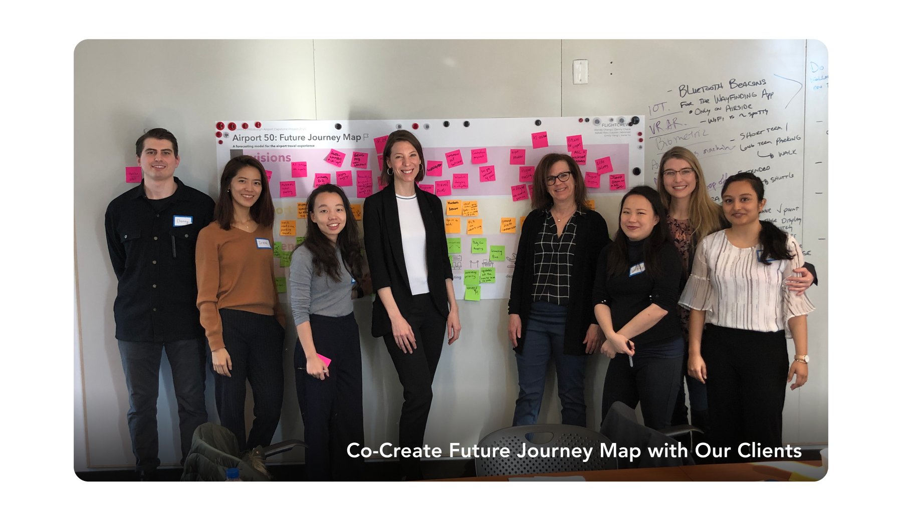
For my capstone project for the Master of Human-Computer Interaction program at Carnegie Mellon, my team partnered with our client, Pittsburgh International Airport (PGH), to reimagine their waiting experience. This project is part of their PITTransformed Modernization Project.
It lasted for seven months as we went from initial exploratory research to product implementation and strategy development.
MY ROLE
Project Manager
Product Designer
METHOD
Semi-structured interviews
Contextual Inquiry
Speed Dating
User Enactment
Usability Tests
Experience Prototype
DURATION
Jan. 2020 - Jul. 2020
7 months
TEAM
Denny Check · Design Lead
Emily Yang · Me
Ketaki Rao · UX Engineer
Lauren Jablonski · Co-Researcher Lead
Irene Yu · Co-Researcher Lead
Wendy Chang · Tech Lead
PROBLEM
Air travelers are often anxious and frustrated.
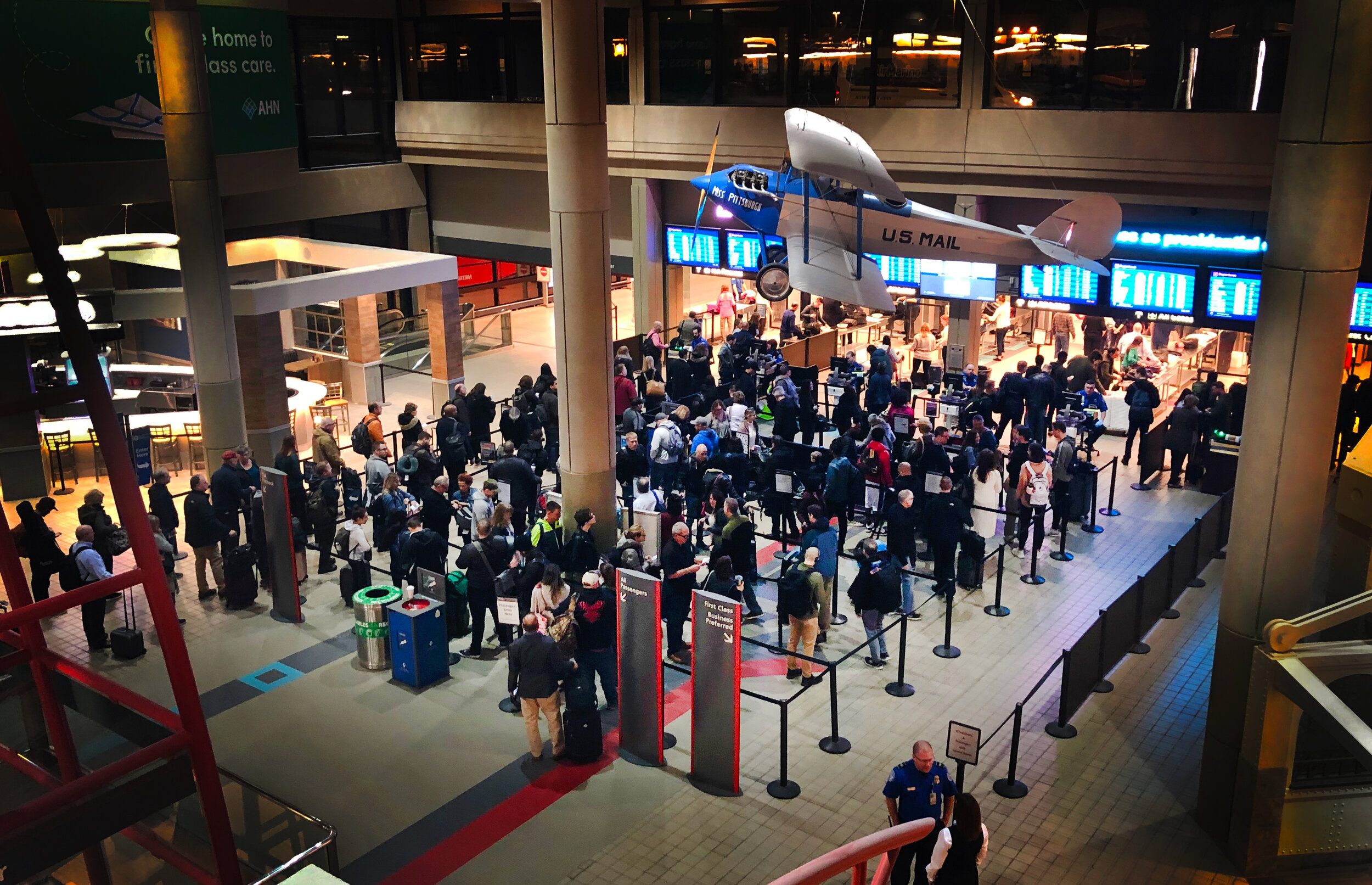
We found that most air traveler’s negative experience originates from the security lane because it is highly unpredictable. To reimagine PGH travelers’ queueing experience in the security lane, we identified high cognitive stress and unknowns at the airport as the root causes.
SOLUTION
PIT+ is a digital service ecosystem designed to give PGH travelers more predictability, control, and efficiency.
To maximize accessibility and account for the full breadth of users, we designed two channels for passengers to access our system, PIT+ — a full service mobile app and a lightweight chat-based messaging system.

This system provides control and efficiency by allowing travelers to reserve a time window for security. It also increases predictability through its customized itinerary planning tool and dynamic map navigation feature.

MY CONTRIBUTION
As a project/product manager, I run our design sprints and set our long-term goal and strategy. Every two weeks, I planned out what needs to be done and informed our team what progress needs to occur to meet our internal deadline. I am also the moderator on our team. I paid attention to everyone's opinion and facilitated conflicts that arose from the team discussion.
I also took the lead on creating the mid-fidelity wireframes and conducted moderated and unmoderated usability tests. Irene and I came up with the idea of using a virtual airport to simulate real-world experience since we weren't able to visit the airport due to COVID-19. We leverage our digital capability and created a virtual airport and fictional airport scenarios to immerse our users in the environment. Our tests produced valuable feedbacks that led us to our final design.
OUR APPROACH
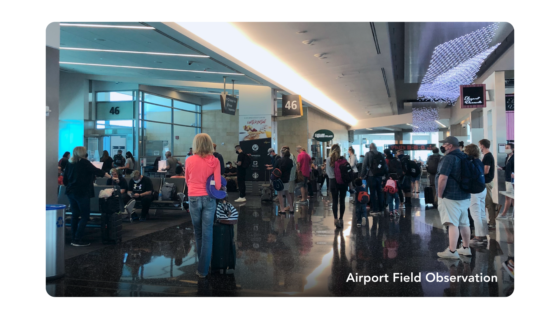
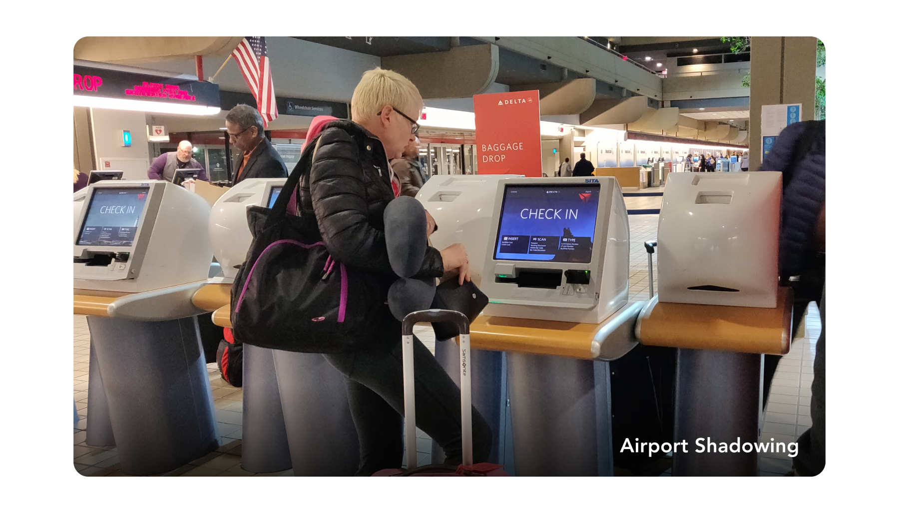
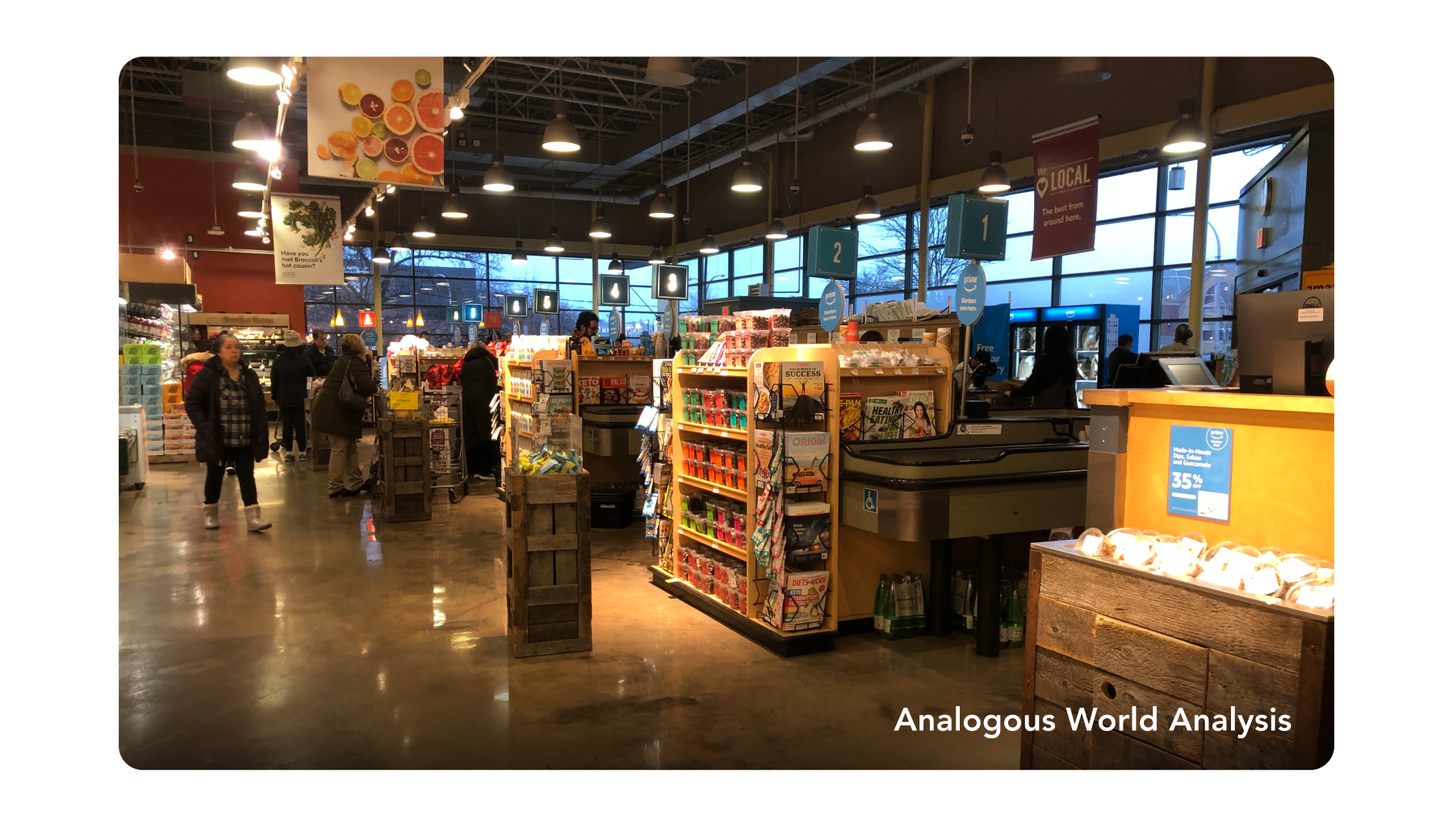
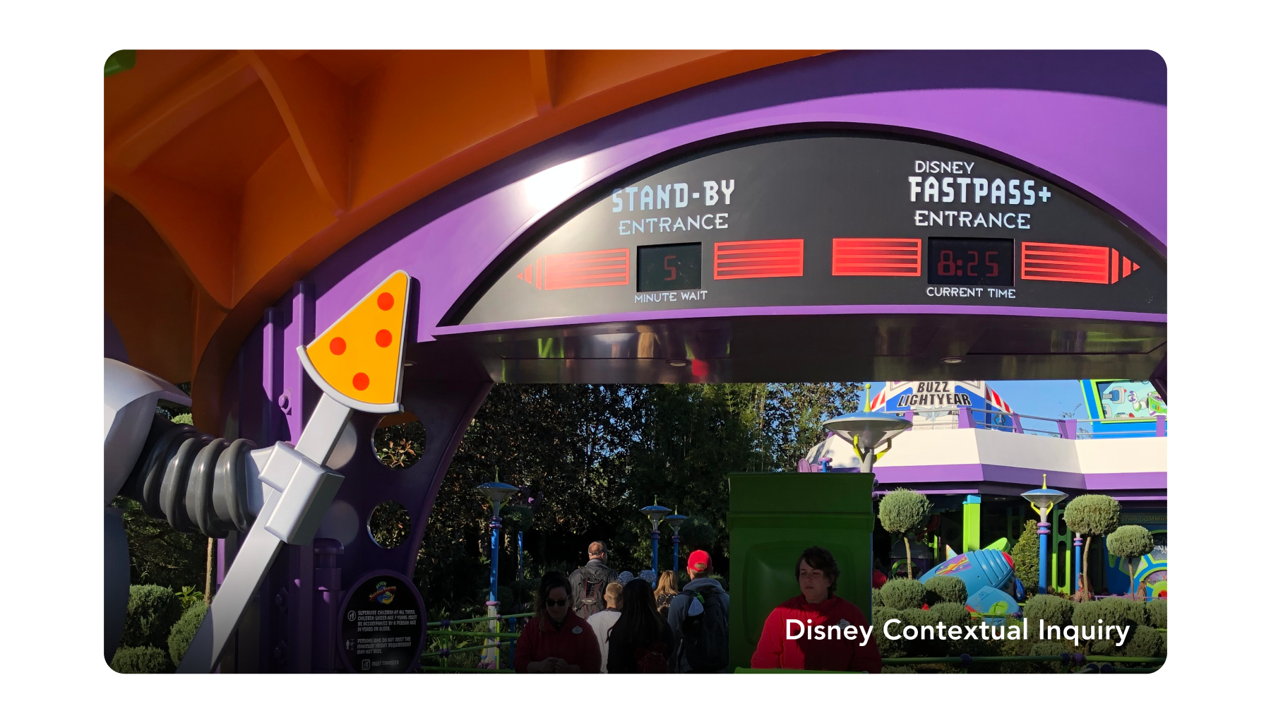
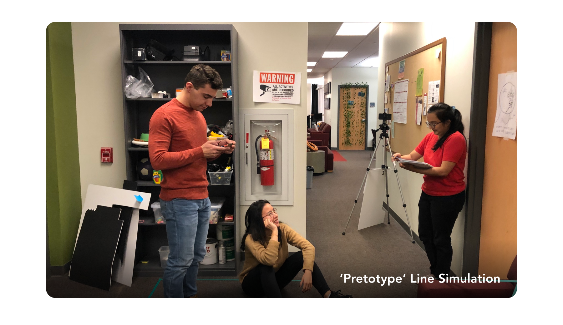
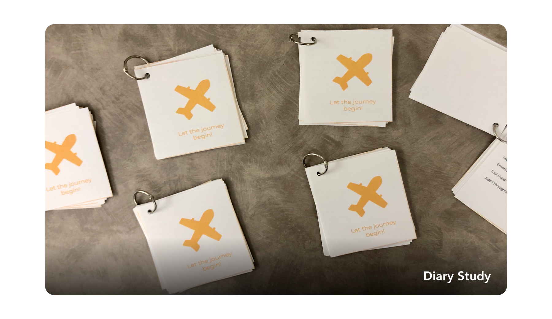
In this phase of our project, we conducted 10+ research activities to better understand travelers’ behaviors, attitudes, perceptions, decision making processes and social engagement associated with waiting in queues. Through a series of primary and secondary research, we decided to focus on making traveler's queueing experience more predictable and efficient.
As we dug deeper to understand why airports are often associate with stress, we found that travelers are especially nervous when they are not in control. Such situation is often caused by these following pain points,


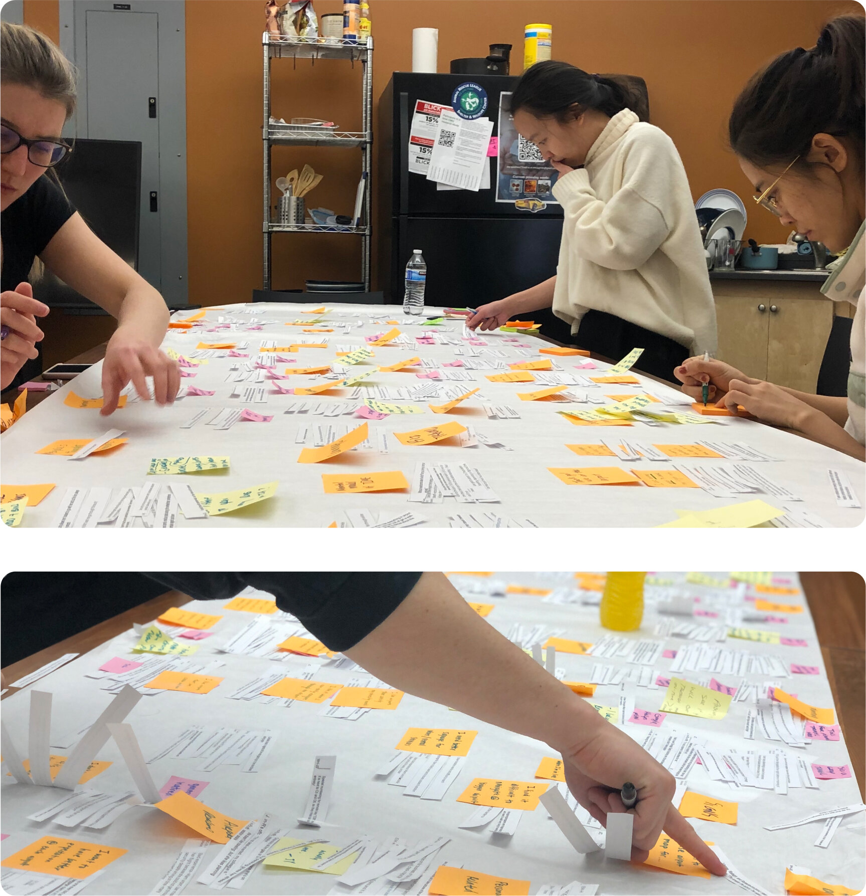
We also synthesized our research through rounds of affinity diagramming and found that
The air traveler's journey starts at home
A user’s journey doesn’t begin at the airport—it actually starts at home, where the user works backwards, calculates and plans for their upcoming trip.Recommendation reduces cognitive load
While traveling, people become anxious due to the large amount of information they need to keep track of.
Perception of wait time can be manipulated
It is influenced by expectations, sense of fairness, visibility of the system, personal emotion and external distractions.
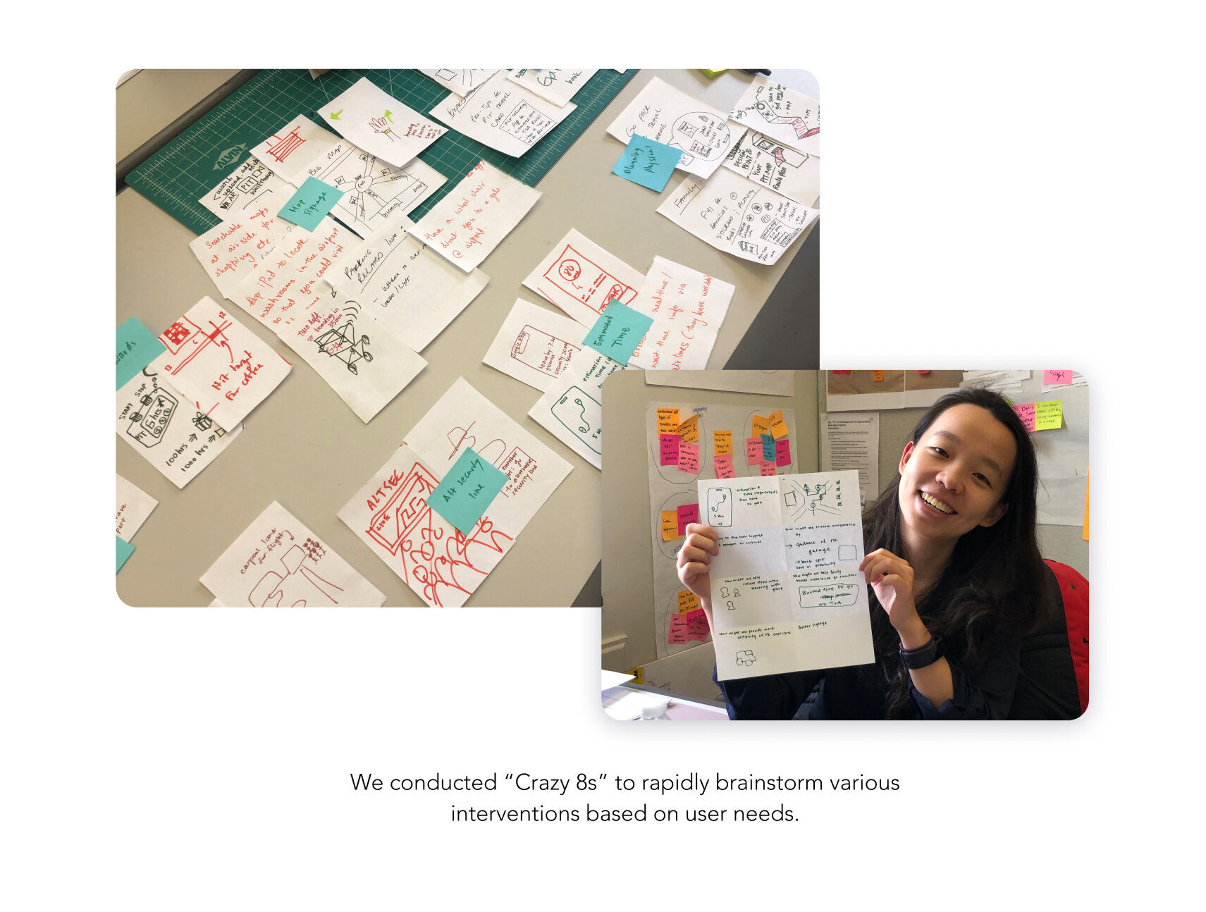
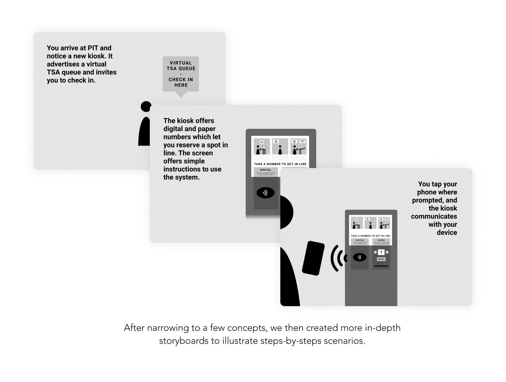
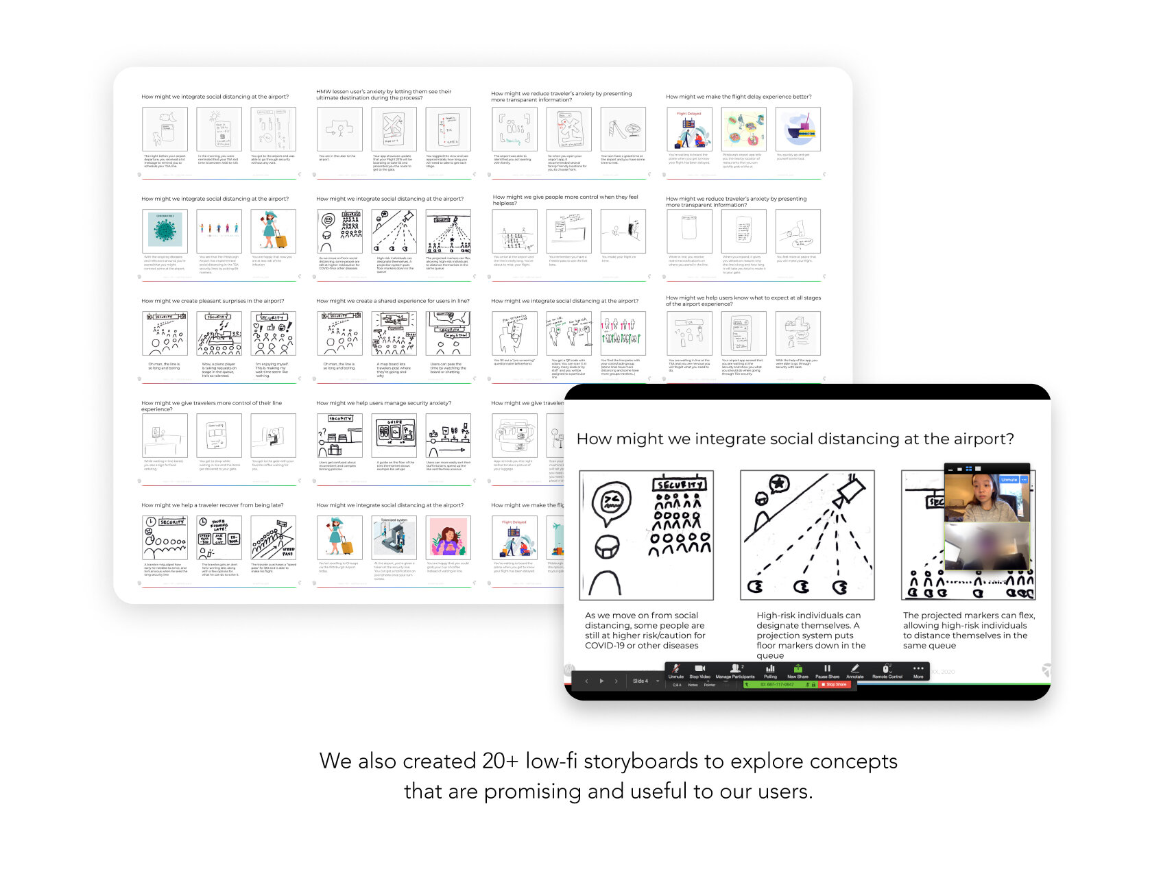
Armed with primary and secondary research data, we then generated multiple design artifacts to refine our problem and brainstormed various solutions. Through iterations of crazy 8, storyboards, and speed datings, we narrowed our solution.
Based on the feedback from our speed dating sessions, we found four ideas that gained more excitement. However, to avoid scope creep, we narrowed down our ideas to two by identifying the most challenging and impactful ones.

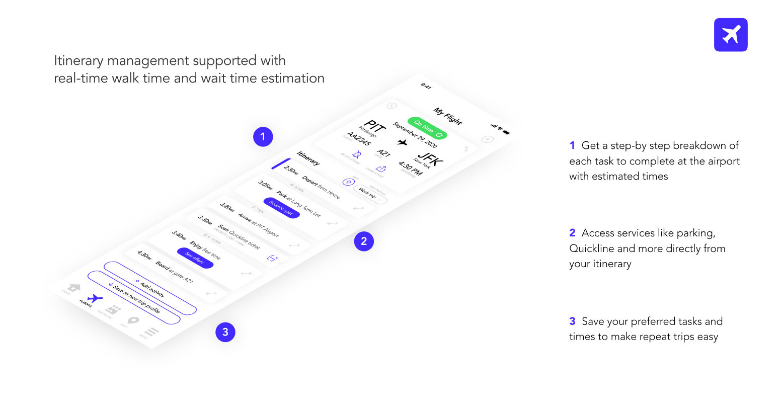
We have discovered that travelers often have a hard time planning their trip to the airport. Some of the things they do to prepare their journey to the airport are
figuring out when to arrive at the airport
determining how much cushion time they need
finding out what they can do while they wait
These can cause a lot of frustration for travelers who are generally anxious about airport experience or/and like to have their trip plan to detail. Therefore, most of our interviewees have identified this idea as a valuable service.

On the other hand, our surveys and interviews also showed that people also experience a lot of anxiety when they wait in the security line. Because not know when they will get through the security lane means that they have the risk of missing their flight.
We also analyzed the PIT passenger arrival distribution data and found that the TSA wait time tend to have sharp peaks that exceed security checkpoint processing capacity.
This showed us the potential to nudge travelers to arrive earlier or later so that we could create a smoother arrival distribution and avoid wait-time spikes.
After reaching a consensus, we created multiple wireframes and tested them on UserTesting.com. As we iterated on our design, we decided to create a dual-channel solution because accessibility is a key to our design – we must account for the full spectrum of travelers regardless of their technological literacy. This is why we prototyped two paths to access our system: a SMS/MMS lightweight chat-based channel and an app-based full service channel.

We conducted ‘Wizard of Oz’ method to simulate a chat service that provides airport information via SMS/MMS channel.
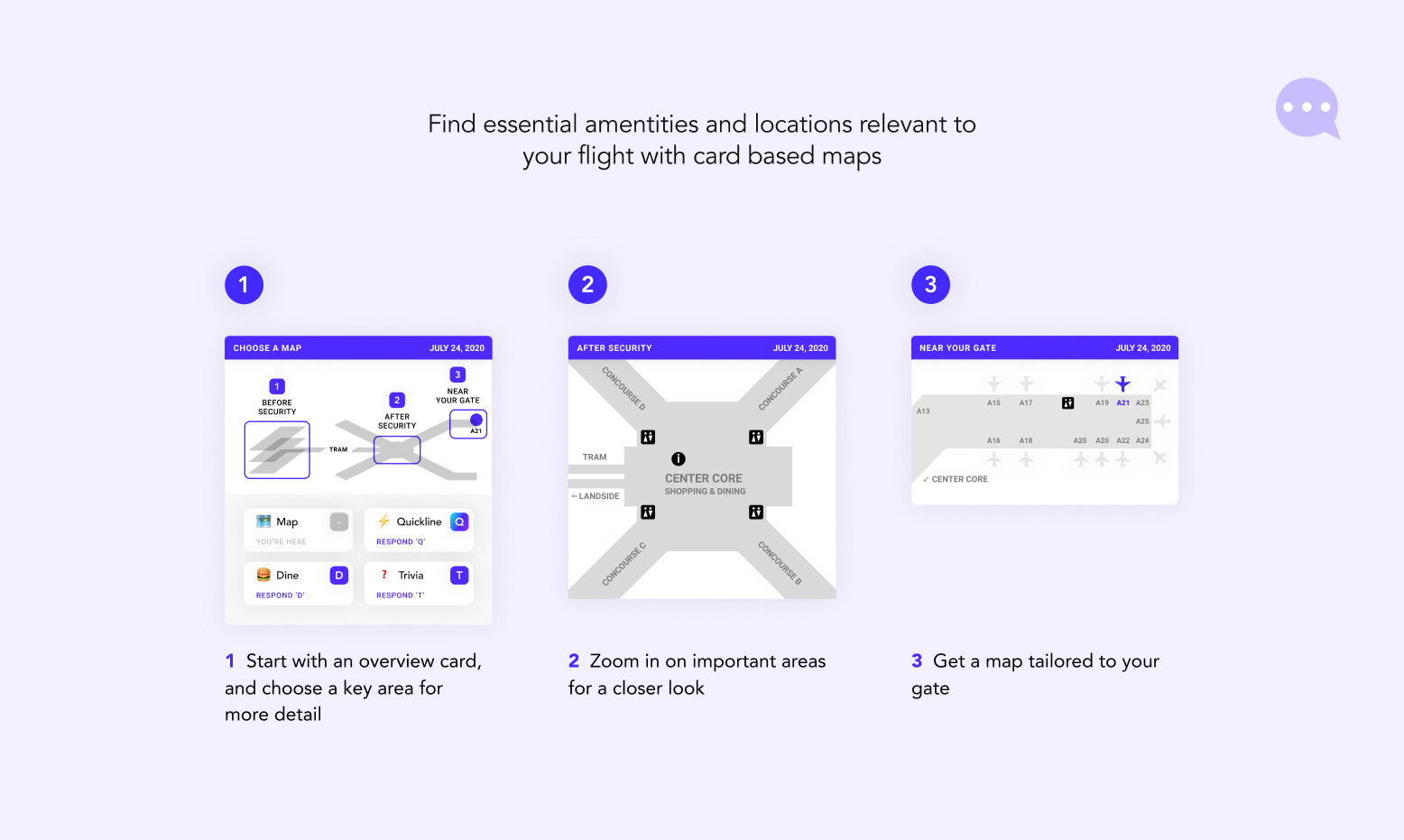
Based on the testings of our lightweight channel, we found that info on airport maps, dining options and security line reservation are the most critical feature to have in quick-access chat system.
We then went through several iterations of design to find the right balance of text and image – such that enough information is conveyed while not overwhelming our users.

We tested our app-based design using Figma prototype and fictional airport scenarios.
After defining the key features in the full service app, we tested our low-fi wireframe on Figma and found
Different users prefers different level of granularity on their flight information - certain aspect of info can be reveal with an extra tap.
Quickline reservation system is not intuitive to all users; therefore require more explanation
Users want access to the different part of the apps on the homepage even with the navigation bar on the bottom
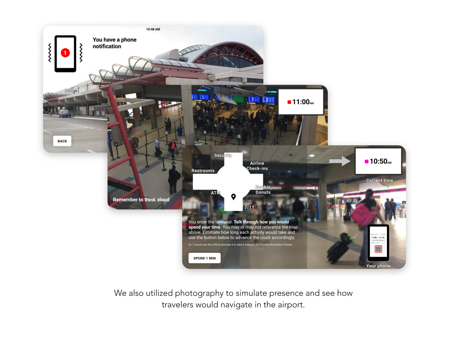
One of the evaluative research methods we did to ensure our system would positively impacts traveler’s airport journey was an immersive research method known as “user enactment”. This test simulated how travelers would interact in a real air travel situation. . Since we lost direct access to onsite-observation (due to COVID-19), we created a generic 3D airport to help us test our solutions.


A Dual-Channel Solution
Access PIT+ with or without a smartphone via a full service mobile app or a lightweight chat-based messaging system.

⟣ Plan Your Trip with Ease ⟢

⟣ Skip the Line ⟢


⟣ Navigate the Airport ⟢

FUTURE STEPS
Our presentation and final design were very well received. More than 100 people showed up and participated in our virtual presentation. PIT airport officials are looking into incorporating our design into their digital ecosystem as they moved forward with their new terminal project.
In the future, Pittsburgh International Airport is hoping to become the leading innovative airport in the industry. We hope that our design will help them take a closer step towards their vision.


